
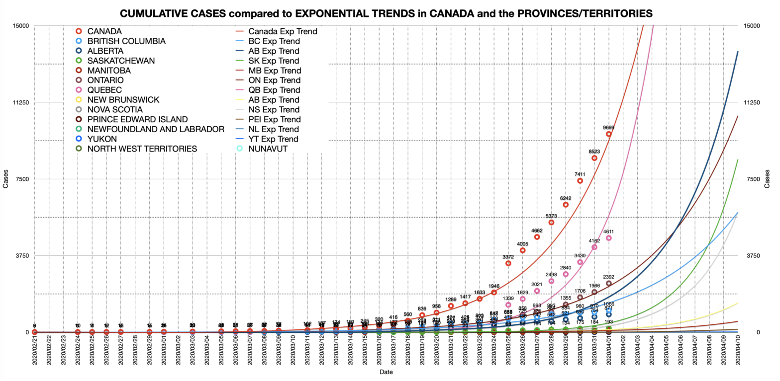
As any long time reader of this blog will know, I like spreadsheets. We’re in a pandemic, which if it wasn’t all so darned apocalyptic, is like super exciting for number nerds.
So I’ve got a thread going on Twitter over the past week and it’s been fun. And again, by fun I mean, a distraction from the overwhelmingly strange and serious nature of it all. You can check it out below. I try to add updates to the graphs every day.
Click here to see the whole Twitter thread.
(You don’t need a twitter account to see it)
The numbers come from the Public Health Agency of Canada which seems to be updating about twice a day. Its website is excellent and is being actively improved! Go check it out.
I’m also tracking the BC specific hospitalizations, ICU and deaths as they are announced daily.
Note that I’m not making any predictions aside from following some lines on a graph. I don’t have any expertise, I am just sharing and describing what I see hopefully in a form that allows you to see the data more easily for yourself.
Listen to the experts. This is deadly serious.
KEEP ISOLATING – KEEP PHYSICALLY DISTANCING
It seems to be working, but will only keep working if we keep doing it.
Feel free to leave a comment on Twitter or if you don’t want to dip your feet in there (smart choice) please do start a conversation on the blog comments here.